Being the start of a new year, I had a look back at the Google Search performance of my websites for the past 12 months. Looking at the Google Search Console reports was frustrating — the numbers were meaningless for a variety of reasons. Thus started my journey into Google Search data analysis, and my search for meaningful search performance metrics…and I thought I’d share the experience. My biggest lesson learned: a year of Google Search data is full of variability and ‘noise’, so don’t expect a simple analysis. Although I have a better understanding of site performance now, I expect this will be a work-in-progress for quite a while…
Starting at the Top
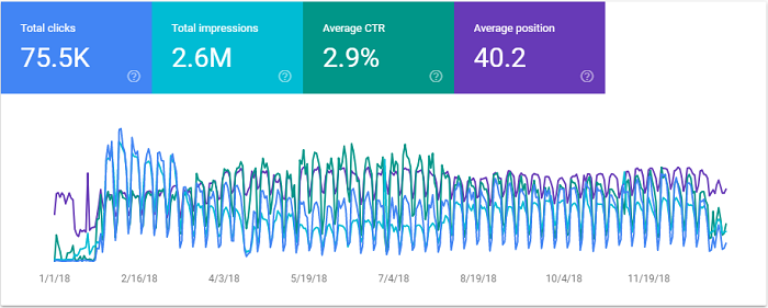
Google Search Console reporting is of questionable value, especially for long-term trend analysis. The daily resolution makes it really hard to see any trends, the choice of colours doesn’t help [I feel pity for anyone that has blue-green colour blindness], and the click-for-detail nature is tedious to use. Yes, you can turn each line on/off so you can see them separately, and you can see differences of a single metric in comparisons, but it is a poor visualization and a rotten analysis tool. Weekly or monthly smoothing would help to reduce the noise. Clicking into the detail loses context, and if one item goes up while another goes down, discovering useful insights is pure luck (or persistence).
You have to download and analyse the details to make any sense of it.
Just a Mess of Data
As I dug into my own data, I wanted to know if the changes I made to the websites over the past year had an effect. Unfortunately for me, I made a lot of changes in 2018, including switching to https and a reorganization that resulted in a lot of page moves. The result is a lot of partial-year page entries. OK, so that was a transition thing, and shouldn’t happen every year…or would it? [quick search: average lifespan of website design: 2-5 years]

I can fix this, I say. Open my trusty Excel workbook, and download my GSC data details using the Analytics Edge add-in and Google Search connector. Remove the http and https prefixes, build a lookup table to map the old URLs to the new ones, perform some macro magic, link some sparkline charts, and…VOILA! Meaningful monthly metrics…or so I thought until I looked at them.

Branded and Off-Topic Searches
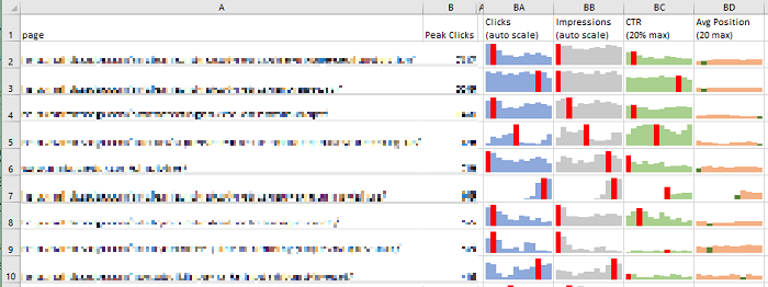
As expected, the second and third rows are actually the same page, before and after a site reorganization. I will have to map from old to new and merge the rows of data. This takes a bit of work since you can’t simply take an average of averages for CTR and position metrics.
The #1 page in the report was my homepage, which makes sense. That should change when I remove branded searches. But a good click-through rate and position of 20+ for the whole year? That’s not right! Turns out that Google Analytics had a problem with the Microsoft Edge browser during the year, and I’ve been getting a super-container-ship-load of off-topic searches (with poor position rankings) for things related to “analytics” and “edge”. Sigh…
GSC’s simple filtering capability means I needed to download all the page+query details for the year, then filter out the branded queries using a nice regular expression. But what do I do with all those off-topic queries? Ideally, I would like to exclude them, but the more I looked at the problem, the more quirks I discovered. I was getting caught up in analysis paralysis!
Search for a Meaningful Search Metric
I know that the average position is a misunderstood metric, easily affected by off-topic and obscure searches that rank poorly. I also know some people simply ignore anything over position 30, but I find that arbitrary threshold a bit too…arbitrary. It would be nice if it was based more on the data than an assumption. This is where I venture off into defining my own rules-of-thumb based on a limited set of data and make some arbitrary assumptions of my own. Well, this is my report, so I can do whatever I want.
What I wanted from the report was to see how the various pages fared in search. I know I have a number of anchor articles, but I also have some middling ones and some wanna-be-found stuff buried in there. I don’t want to cut off at an arbitrary position because I will never see the wanna-be-found stuff (you know, a number of long-tail search impressions way down in the results because my article didn’t use the same words that people search for).
All of these pages have a wide range of impressions spread over a wide range of positions. What I wanted to see was the best positions, not an average . If I restricted the data to the queries within about 10 positions of the best for that page, the results started to look more like one would hope for…less noisy, and more meaningful.
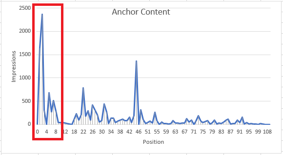
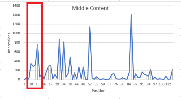
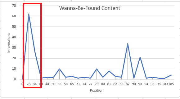
So I now have a ‘best position’ metric for my report, but by filtering out the lower-position ‘noise’, I also removed the clicks and impressions at those positions as well. The volume drops off significantly, but the report will be more focused and I can be more confident in any observations I make.
What If Off-Topic Queries Rank Higher?
Of course, there is a gotcha. Maybe you’ve seen this shortly after a Google Search algorithm change: one of your wanna-be-found pages starts ranking on page 1 for a really off-topic query. No clicks, just lots of impressions. Sigh… Let me tell you, THAT really messes up your metrics! Even if it is just for a day.

This is something you shouldn’t try to automate…there are too many opportunities to include or exclude the wrong data. So I created an extract of the page-query combinations that were non-branded, merged URLs, having removed the lower positioned ‘noise’, and manually identified the handful of these off-topic spikes in the rankings. Filtering those out of the raw data, I can finally generate a report that lets me see the ‘best position’ performance of my website pages. Now I can make some observations and plans for 2019 content optimization.

Summary
It is not enough to simply report aggregated metrics from Google Search Console — the numbers are polluted by the variability that is found in web searches. Extracting detailed page-and-query data in monthly chunks allows you to identify and removed the ‘noise’ so you can have confidence in the results.
To give you some idea of how this all came together, in my analysis, I started with raw data extracted from the Google Search API in monthly buckets:
- 175,483 rows of raw data
- 163,364 rows after filtering out branded and high-ranking, off-topic search queries
- 155,510 rows after merging URLs for pages that moved over the year
- 24,772 rows were left after filtering for ‘best position’ (that’s only 16% of the data)
- 99 pages had enough data worthy of including in my final summary
The purpose of this analysis was to get clean data so I could identify search ranking problems and opportunities. Mission accomplished.
I was surprised to find about 84% of the data from Google Search Console was ‘noise’, which makes me wonder if I have gone too far.
Analytics Edge customers can download the workbook I used in a companion How To article.